

IELTS Cambridge Book 5 Test 1 AC – Task 1
Question –
WRITING TASK 1
You should spend 20 minutes on this task.
The graph below shows the proportion of the population aged 65 and over between 1940 and 2040 in three different countries.
Summarise the information by selecting and reporting the main features, and make comparisons where relevant.
You should write at least 150 words.
Answer –
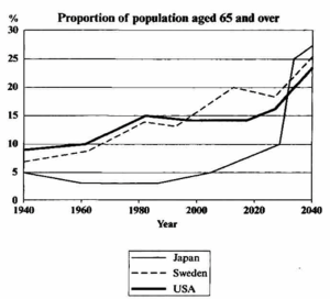
The bar chart displays the percentage of those aged 65 and above in the populations of three countries from 1940 with projections to 2040.
Overall, the graph indicates that the older populations of all three countries increased until 2020, and the same trend is predicted for the future years. While in 1940, the USA and Japan had the highest and lowest proportions of elderly citizens, 65+, respectively, they are expected to switch positions by 2040.
In the past, the proportion of the elderly in the USA was the highest, at around 9% in 1940, and after that, it grew to 15% after 40 years before remaining relatively stable until 2020. Sweden’s value started at around 7%, and despite fluctuations, it increased to a fifth over the next 80 years. However, the proportion of the Japanese who were 65 and over was 5% at the beginning of the period; it then fell to roughly 3% in 1960, and only after 1990 did it rise to roughly 7% by 2020.
Looking at the future, after dipping briefly, Sweden’s elderly contingent will reportedly rise to account for a quarter of its population in 2040, and the USA’s is forecast to climb to approximately 23%. Meanwhile, this contingent is predicted to skyrocket to reach the top in Japan, making up about 27% of the total population in 2040.