IELTS Cambridge Book 17 Test 3 AC – Task 1
Question –
WRITING TASK 1
You should spend 20 minutes on this task.
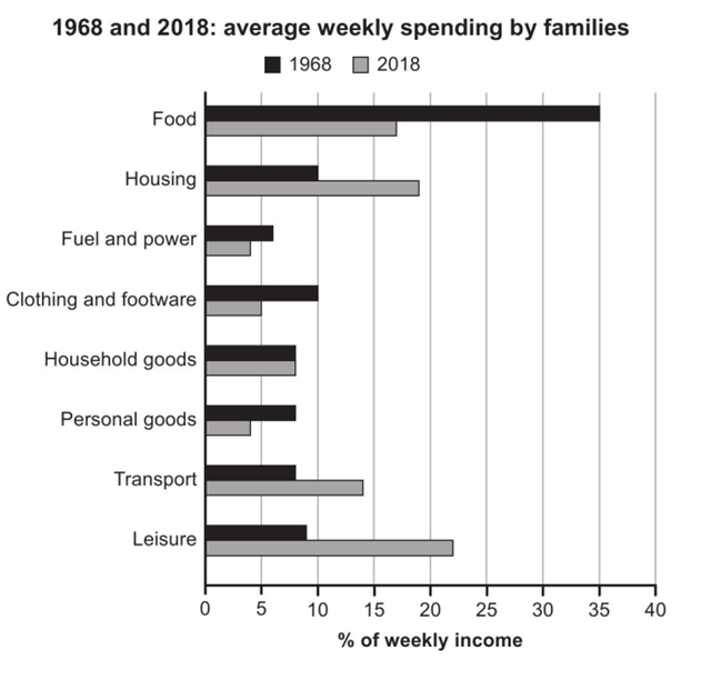
The chart below gives information about how families in one country spent their weekly income in 1968 and in 2018.
Summarise the information by selecting and reporting the main features, and making comparisons where relevant.
Write at least 150 words.

Sample Answer – 1
The bar chart depicts how much money per week on average was spent by families on eight products in a particular nation in 1968 and 2018.
Overall, the share of weekly income spent on all the given categories changed significantly/either increased or decreased, except for household goods, which remained the same after a half-century. Moreover, the proportion of income expended on food was overtaken by leisure activities in 2018.
Looking at 1968, the highest proportion of income spent per week was on food, with around a third, followed by housing and ‘clothing and footwear’, each claiming a fifth of total weekly spending. This figure for leisure activities was around 8%, which was roughly 2% more than that for fuel and power, but for household goods, personal goods, and transport, the expenditure values were the same, at around 7%.
However, after half a decade, weekly expenditure on free time activities roughly tripled to around a quarter, making it the highest value in the latter year. While the shares of housing and transport roughly doubled, the money spent on food was cut down by about half after 50 years. Household goods’ value remained the same, and at the same time, all other remaining categories’ figures were 5% or just less.
OR (sample Answer 2)
The bar chart depicts the average weekly amount of money families spent on eight products in a particular nation in 1968 and 2018.
Overall, the share of weekly income spent on housing, transport, and leisure activities increased, while this figure for household goods remained the same after a half-century. However, the remaining categories experienced a fall in their figures over the same period.
Looking at decreasing values, at the start of the period, the highest proportion of income spent per week was on food, with around a third, and it then dropped sharply to around 18% in 2018. Similarly, the figures for ‘clothing and footwear’ and personal goods went down by half and around half to 5% and roughly 4% after 50 years. Moreover, per week spending on fuel and power dipped from around 6% in 1968 to around 4% in 2018.
Focusing on the remaining categories, the most significant rise was seen in the leisure category, as people increased their expenditure to just more than triple on free time activities, from around 8% to around a quarter, making it the highest value in the latter year. Between 1968 and 2018, the figures for housing and transport also soared from 10% and 7% to roughly a fifth and about 15%, respectively. However, the outlay on household goods stayed precisely the same at around 7% in both years.


