IELTS Cambridge Book 13 Test 2 AC – Task 1
Question –
WRITING TASK 1
You should spend 20 minutes on this task.
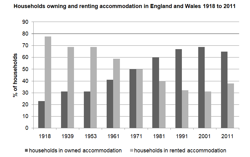
The chart shows the percentage of households in owned and rented accommodation in England and Wales between 1918 and 2011.
Summarise the information by selecting and reporting the main features, and make comparisons where relevant.
Write at least 150 words.

Answer –
The bar graph displays the proportion of households living in either owned or rented housing in England and Wales from 1918 to 2011.
Overall, the percentage of rented accommodations experienced a significant decline, whereas ownership of houses rose considerably over the period in question. Moreover, more households lived in rented housing in the first half of the period, while this trend reversed in the latter half.
Looking at rented housing, renting accounted for approximately 78% of households at the start of the period, and this declined to just below 70% in 1939 and remained the same until 1953. It then fell to 50% in 1971, and this category continued to fall to reach its lowest level, at roughly 31%, in 2001. However, there was a slight rebound in 2011 to about 38%.
In 1918, around a quarter of homes were owned, after which this went up to just over 30% in 1939, a figure which did not change until 1953 before rising to precisely 50% in 1971, and it was identical to rental accommodations’ figure. After that, the increase continued year on year until 2001, when the figure stood at almost 70% before it fell slightly to approximately 64% by the period’s end.


