

IELTS Cambridge Book 8 Test 2 AC – Task 1
Question –
WRITING TASK 1
You should spend 20 minutes on this task.
The three pie charts below show the changes in annual spending by a particular UK school in 1981, 1991 and 2001.
Summarise the information by selecting and reporting the main features, and make comparisons where relevant.
You should write at least 150 words.
Answer –
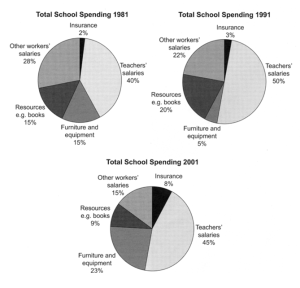
The three pie graphs display how one school in the UK spent its annual budget on five different categories in 1981, 1991, and 2001.
Overall, the percentage of the total budget spent on insuring the school went up constantly, while this figure for paying other workers’ salaries dipped steadily over the recorded period. In addition, paying teachers consumed the biggest portion of the budget every year.
Focusing on wages, in 1981, the highest proportion of the budget was spent on salaries of teachers, at 40%, and this rose to precisely half of the total budget 10 years later, before falling slightly by 5% after a decade. Moreover, remuneration given to non-teaching staff comprised around a quarter of total expenditure in 1981 and 1991, but it dropped sharply to 15% by the period’s end.
Looking at the remaining categories, the outlay on resources such as books for students accounted for 15% at the start of the period, and this value firstly increased to a fifth and then decreased to just less than a tenth. In contrast, the trend of spending on furniture and equipment was exactly opposite to resources; the values were 15%, 5%, and 23% in the three years, respectively. However, insurance costs rose consistently between 2% in 1981 and 8% in 2001.