

IELTS Cambridge Book 9 Test 4 AC – Task 1
Question –
WRITING TASK 1
You should spend 20 minutes on this task.
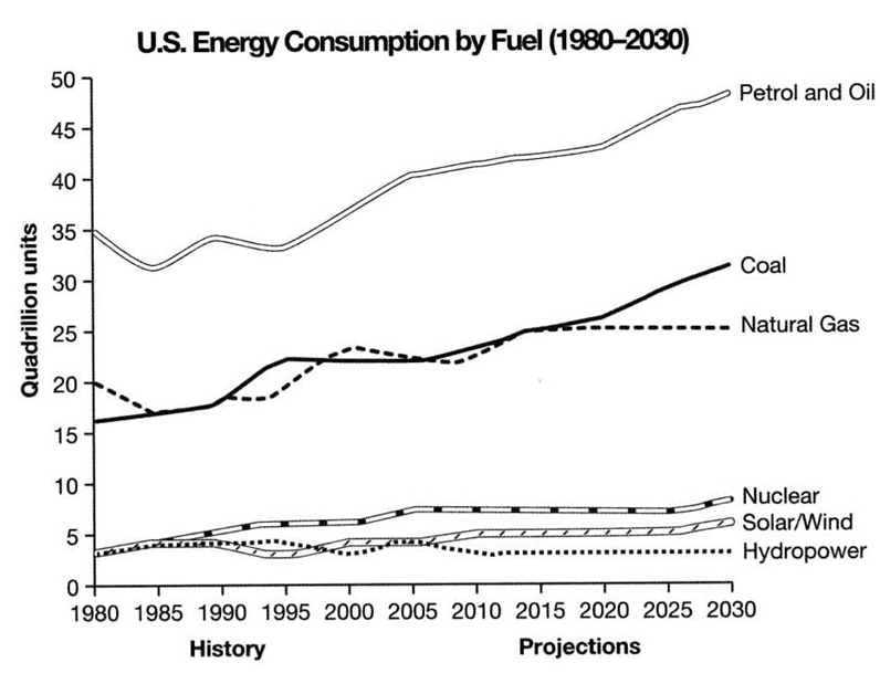
The graph below gives information from a 2008 report about consumption of energy in the USA since 1980 with projections until 2030.
Summarise the information by selecting and reporting the main features, and making comparisons where relevant.
Write at least 150 words.
Answer –
The line graph provides information about how much energy was consumed from six different kinds of fuels in America from 1980 to 2008, with predictions up to 2030.
Overall, from 1980 to 2008, the amount of energy produced from all sources, except hydropower, increased. The projections show that dependence on petrol, oil, and coal will continue to grow, while the others’ values are to remain relatively stable but insignificant.
From the start, energy generated from petrol and oil power plants was consumed the most, starting at 35 quadrillion units, and this figure increased to roughly 42 quadrillion units by 2008. Natural gas’ value began at 20 and coal’s at about 16, but both increased to the same figure of around 25 quadrillion units after 28 years. Consumption of energy derived from hydro, nuclear, solar and wind power plants was approximately 4 quadrillion units each, but whereas the first two grew to around 7 and 5 quadrillion units, respectively, hydropower’s value remained relatively constant by 2008.
Looking at the future, energy derived from petrol and oil, and coal is forecast to continue increasing by roughly 5 and 6 quadrillion units, likely becoming the leading and second leading producers of energy, respectively. The other four power sources are predicted to remain stable until 2030, except for an additional one quadrillion units for nuclear and solar power after 2025.