IELTS Cambridge Book 18 Test 2 AC – Task 1
Question –
WRITING TASK 1
You should spend 20 minutes on this task.
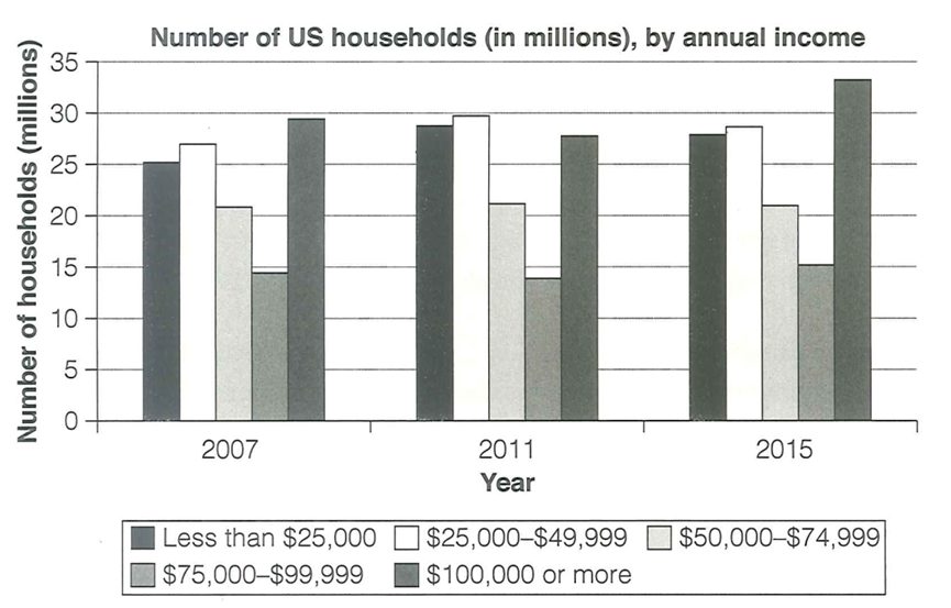
The chart below shows the number of households in the US by their annual income in 2007, 2011 and 2015.
Summarise the information by selecting and reporting the main features and making comparisons where relevant.
Write at least 150 words.

Answer –
The bar chart displays how many households earned how much money annually according to five income brackets in 2007, 2011, and 2015.
Overall, the number of households increased for all income bands, except for $50,000-$74,999, whose figure remained constant over the period given. Moreover, most households fell in the highest income bracket in 2007 and 2015, while the fewest households earned between $75,000 and $99,999 in all three years.
Focusing on the higher income bands, the number of households that earned at least $100,000 was the highest in 2007, at around 30 million, and then, this value increased further to reach the chart high of roughly 33 million by the period’s end. 25 million and around 26 million households were earning under $25,000, and between $25,000 and $49,999 in 2007, after which the figures grew marginally by around 3 million before falling by around 1 million.
Looking at the lower values, the number of households whose income fell between $50,000 and $74,999 started the given at around 21 million, and this figure remained stable throughout the period shown. Similarly, although the figure for those earnings from $75,000 to $99,999 increased marginally, it remained the lowest over the period in question, from just less than 15 million in 2007 to precisely 15 million in 2015.


