

IELTS Cambridge Book 10 Test 1 AC – Task 1
Question –
WRITING TASK 1
You should spend 20 minutes on this task.
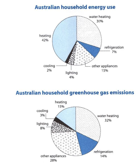
The first chart below shows how energy is used in an average Australian household. The second chart shows the greenhouse gas emissions which result from this energy use.
Summarise the information by selecting and reporting the main features, and make comparisons where relevant.
You should write at least 150 words.
Answer –
The two pie charts represent how energy is utilised in the average home in Australia and the greenhouse gases emitted from this electricity use.
Overall, what stands out is that the most power is consumed to heat both the home and the water, while the figures for greenhouse gases emitted by ‘other devices’ and water heating are the highest.
Regarding power utilisation, Australians use the vast majority of energy to warm the home and heat water, as the former takes up around 40% and the latter nearly a third of the total. The amount of power utilised by refrigeration, cooling, and lighting combined, at 13%, is similar to the figure for ‘other appliances’ at 15%.
Looking at greenhouse gas emissions, water heating and cooling equipment produce similar amounts of greenhouse gases as the amounts of electricity they consume, at around a third and 3%, whereas the figure for refrigerators and lighting doubled to 14% and 8%, respectively. However, ‘other appliances’ emit around a quarter of total greenhouse gases, and the share of heating devices amounts to 15%.
OR (Sample Answer for Second Diagram)
Looking at greenhouse gas emissions, water heating is the largest contributor, at around a third of the total, followed by ‘other appliances’ at roughly a quarter. Refrigeration produces nearly the same amount of greenhouse gas as heating, with 14% and 15%, respectively. Lighting, at 8%, releases 5% more greenhouse gases than cooling.