Question –
WRITING TASK 1
You should spend 20 minutes on this task.
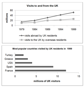
The line graph shows visits to and from the UK from 1979 to 1999. The bar chart shows the most popular countries visited by UK residents in 1999.
Summarise the information by selecting and reporting the main features, and make comparisons where relevant.
You should write at least 150 words.

Answer –
The line graph displays how many Britishers visited abroad and the figure for overseas people who came to visit the UK between 1979 and 1999, whereas the bar chart represents the number of UK residents visiting five different nations in 1999.
Overall, the number of visits to and from the UK increased gradually and significantly over the given period. Furthermore, France was the most popular destination for the people of the UK, while Turkey was their least favourite place to visit.
In 1979, around 15 million residents of the UK travelled abroad, after which this figure rose sharply to reach a chart high of roughly 55 million over the next twenty years, remaining the highest value throughout the period. As for incoming visitors, this value started the period at approximately 10 million before increasing gradually to just below 30 million by the final year.
In 1999, France was visited by the most UK residents, at roughly 12 million, followed by Spain, at approximately 9 million. The USA and Greece had about 4 million and 3 million visitors, respectively. Turkey was the least popular country among the British, with only about 2 million tourists.


