Question –
WRITING TASK 1
You should spend 20 minutes on this task.
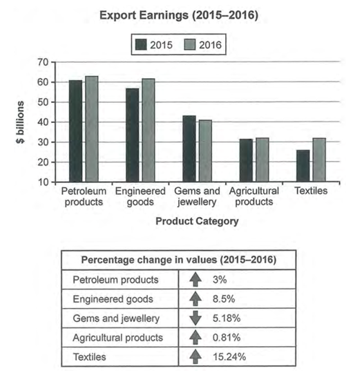
The chart below shows the value of one country’s exports in various categories during 2015 and 2016. The table shows the percentage change in each category of exports in 2016 compared with 2015.
Summarise the information by selecting and reporting the main features, and make comparisons where relevant.
Write at least 150 words.

Answer –
The bar graph displays the amount of money, in billion dollars, a country earned via the export of 5 different products in 2015 and 2016, while the table depicts the percentage increase or decrease in earnings in each category in 2016 compared to 2015.
Overall, what stands out is that export earnings increased for all categories listed but not for gems and jewellery, which saw a decline in value over the period in question. Moreover, petroleum products generated the highest export revenue, while earnings from textile exports were the lowest across both years.
Looking at the two highest exported categories, the income generated from the export of petroleum products in 2015 was the highest, at around $61 billion, and it rose even further by 3% to approximately $63 billion by next year. The figure for engineered goods went up from around $58 billion in 2015 to roughly $61 billion in 2016, a rise of 8.5% in one year.
Focusing on the lower amounts of exports, around a quarter of 100 billion dollars were earned by trading textiles to other nations, and it witnessed the most significant growth of 15.24% to around $31 billion in 2016. On the other hand, agricultural products experienced the lowest increment of 0.81% and also ended the period at around $31 billion. However, merchants of gems and jewellery saw their business lose 5.18%, falling from approximately $43 billion to about $41 billion.


